 Design
Colors
Color is a fundamental part of the BoldTrail brand. It helps us create consistent, recognizable experiences across all our products and marketing. We use color intentionally to distinguish our brand and add meaning to every design.
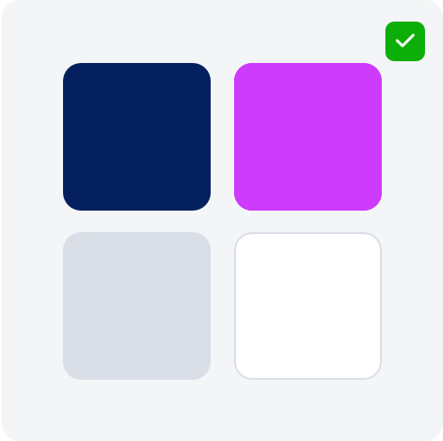
Primary Palette
Primary Navy
WEB: #05205E
RGB: 0, 33, 98
CMYK: 100, 93, 31, 28
Primary Magenta
WEB: #CD00FC
RGB: 205, 0, 252
CMYK: 44, 82, 0, 0
Primary Gray
WEB: #DADEE7
RGB: 218, 222, 231
CMYK: 13, 9, 4, 0
Primary White
WEB: #FFFFFF
RGB: 255, 255, 255
CMYK: 0, 0, 0, 0
Full Color Palette
Darkest Navy
WEB: #000207
RGB: 0, 2, 7
CMYK: 100, 71, 0, 97
Darkest Magenta
WEB: #520064
RGB: 82, 0, 100
CMYK: 18, 100, 0, 61
Darkest Gray
WEB: #4D5976
RGB: 77, 89, 118
CMYK: 35, 25, 0, 54
Darker Navy
WEB: #03153D
RGB: 3, 21, 61
CMYK: 95, 66, 0, 76
Darker Magenta
WEB: #8F00B0
RGB: 143, 0, 176
CMYK: 19, 100, 0, 31
Darker Gray
WEB: #99A4BD
RGB: 153, 164, 189
CMYK: 19, 13, 0, 26
Primary Navy
WEB: #05205E
RGB: 0, 33, 98
CMYK: 100, 93, 31, 28
Primary Magenta
WEB: #CD00FC
RGB: 205, 0, 252
CMYK: 44, 82, 0, 0
Primary Gray
WEB: #DADEE7
RGB: 232, 232, 232
CMYK: 8, 6, 6, 0
Lighter Navy
WEB: #364C7E
RGB: 54, 76, 126
CMYK: 57, 40, 0, 51
Lighter Magenta
WEB: #E166FD
RGB: 225, 102, 253
CMYK: 11, 60, 0, 1
Lighter Gray
WEB: #F3F5F7
RGB: 243, 245, 247
CMYK: 2, 1, 0, 3
Lightest Navy
WEB: #69799E
RGB: 104, 121, 158
CMYK: 34, 23, 0, 38
Lightest Magenta
WEB: #EEA0F9
RGB: 238, 160, 249
CMYK: 4, 36, 0, 2
Lightest Gray
WEB: #FBFBFC
RGB: 251, 251, 251
CMYK: 0, 0, 0, 1
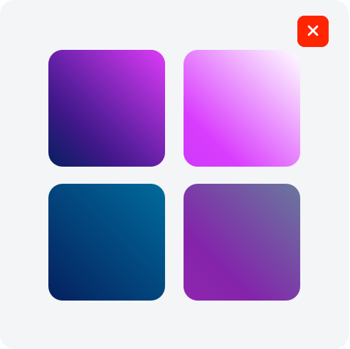
Gradient Palette
Logo Gradient
Magenta Gradient
Light Gradient
Gray Gradient
Pantone PMS Color Palette
PANTONE
2758C
PANTONE
Purple C
PANTONE
427C
Usage Guidelines
Consistent use of color helps us build recognition and convey our brand personality across all channels and materials. Use primary brand colors as the main foundation in designs. These colors should dominate layouts, backgrounds, and key brand elements.
Do’s

DO ensure sufficient contrast between text and background for accessibility.

DO prioritize primary colors in all major branded applications.
DO use only approved colors and values provided in this style guide.
Dont’s

DO NOT combine product colors with our parent brand colors.
DO NOT create new, or alter brand colors without approval.
DO NOT use colors in combinations that reduce legibility or clash visually.
DO NOT use unapproved gradient color combinations.