 Design
Typography
Our typography is an essential part of our brand identity. Consistent use of fonts helps communicate our personality, improve readability, and create a cohesive experience across all materials.
Sora
Sora is an open-source Google Font. Download the full font family to use for headlines, subheadings, or callouts. Avoid using Sora for body copy, as extended text can impact legibility. Use this font sparingly to maintain readability and visual clarity.
The quick brown fox jumps over the lazy dog.
Albert Sans
Albert Sans is a Google Font. Download the whole family and use it for the subheadlines, body, and captions in your Inside Real Estate presentations and assets.
The quick brown fox jumps over the lazy dog.
Usage Guidelines
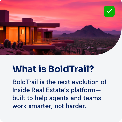
Our typography reinforces a consistent, professional brand voice. Use approved fonts and styles to create clear hierarchy and maintain readability across all materials. Avoid unapproved substitutions, and replace all old font instances with either Sora or Albert Sans. Here is an example of our preferred typographic hierarchy:
Headline – Sora Bold
The quick brown fox jumps over the lazy dog.
Subheadline – Albert Sans Semibold
The quick brown fox jumps over the lazy dog.
Body – Albert Sans Medium or Regular
The quick brown fox jumps over the lazy dog.
Caption – Albert Sans Medium or Regular
The quick brown fox jumps over the lazy dog.
Do’s

DO Align text left for readability, unless otherwise specified.

DO maintain proper hierarchy (e.g., headlines larger and bolder than body text).

DO ensure clear contrast between text and background.
Dont’s

DO NOT substitute with unapproved fonts (e.g., Proxima Nova, Figtree, or Source Sans)

DO NOT use too many different font sizes or weights in a single layout.

DO NOT place text over busy backgrounds.

 Video
Video Content
 Need Help?