 Design
Colors
Color is the cornerstone of Inside Real Estate design. It distinguishes our brand and helps us to create consistent experiences across marketing and products. We use color in meaningful ways in all expressions of our brand.
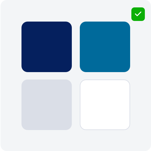
Primary Palette
WEB: #05205E
RGB: 0, 33, 98
CMYK: 100, 93, 31, 28
WEB: #006A9B
RGB: 0, 106, 155
CMYK: 92, 55, 19, 2
WEB: #DADEE7
RGB: 218, 222, 231
CMYK: 13, 9, 4, 0
WEB: #FFFFFF
RGB: 255, 255, 255
CMYK: 0, 0, 0, 0
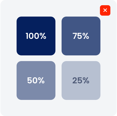
Supporting Gradient
Usage Guidelines
Consistent use of color helps us build recognition and convey our brand personality across all channels and materials. Use primary brand colors as the main foundation in designs. These colors should dominate layouts, backgrounds, and key brand elements.
Do’s

DO ensure sufficient contrast between text and background for accessibility.

DO prioritize primary colors in all major branded applications.
DO use only approved colors and values provided in this style guide.
Dont’s
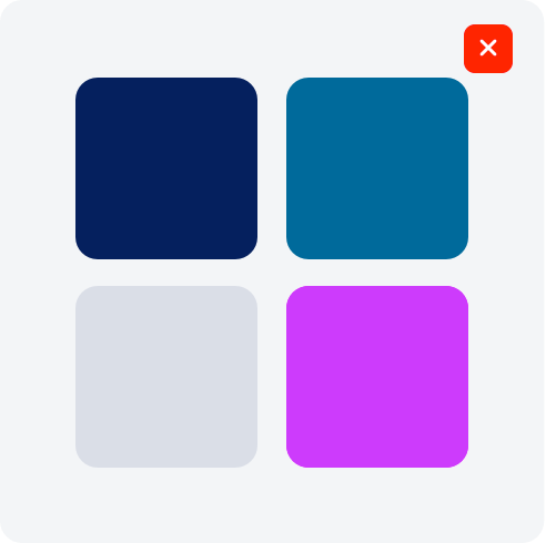
DO NOT combine product colors with our parent brand colors.
DO NOT create new, or alter brand colors without approval.

DO NOT use colors in combinations that reduce legibility or clash visually.